|
|
|
|

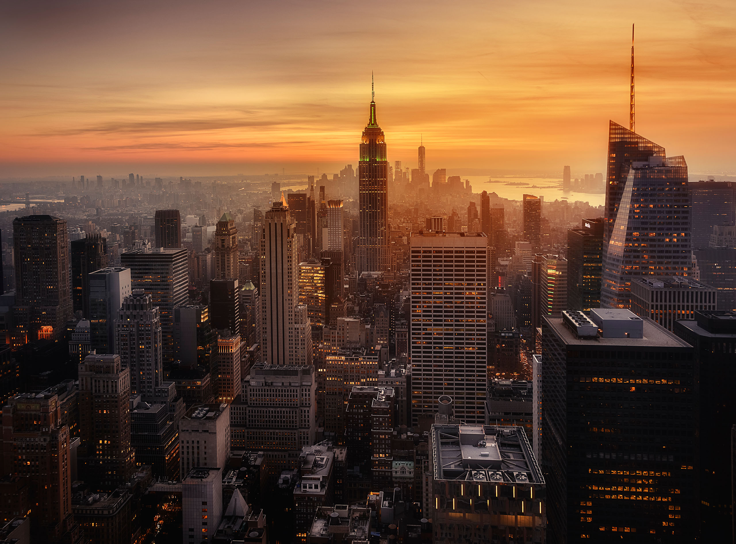
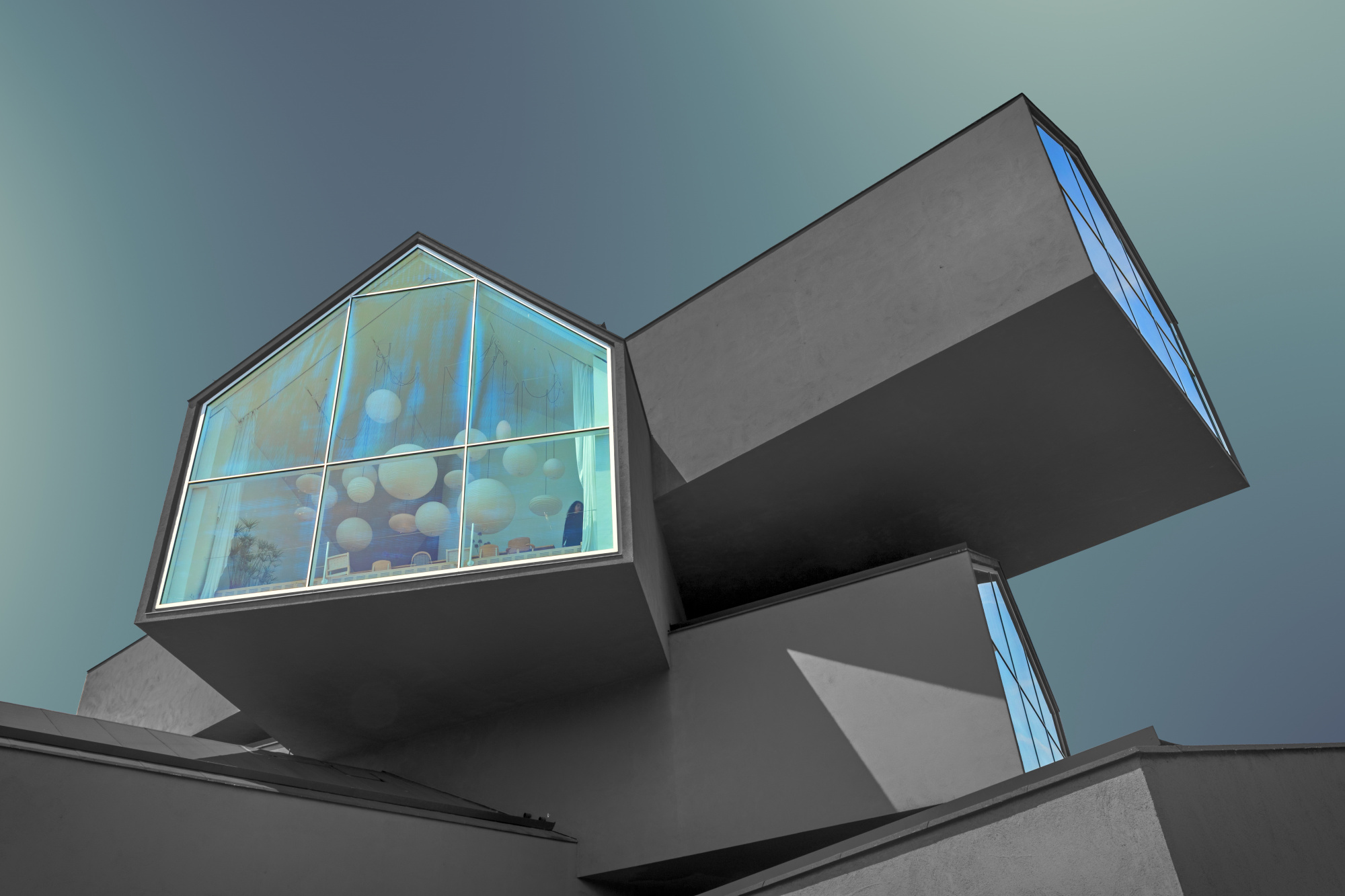
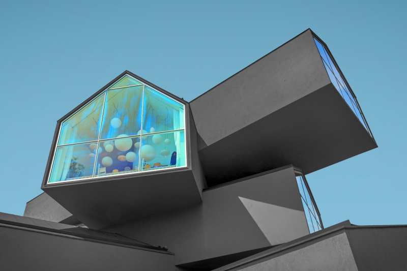
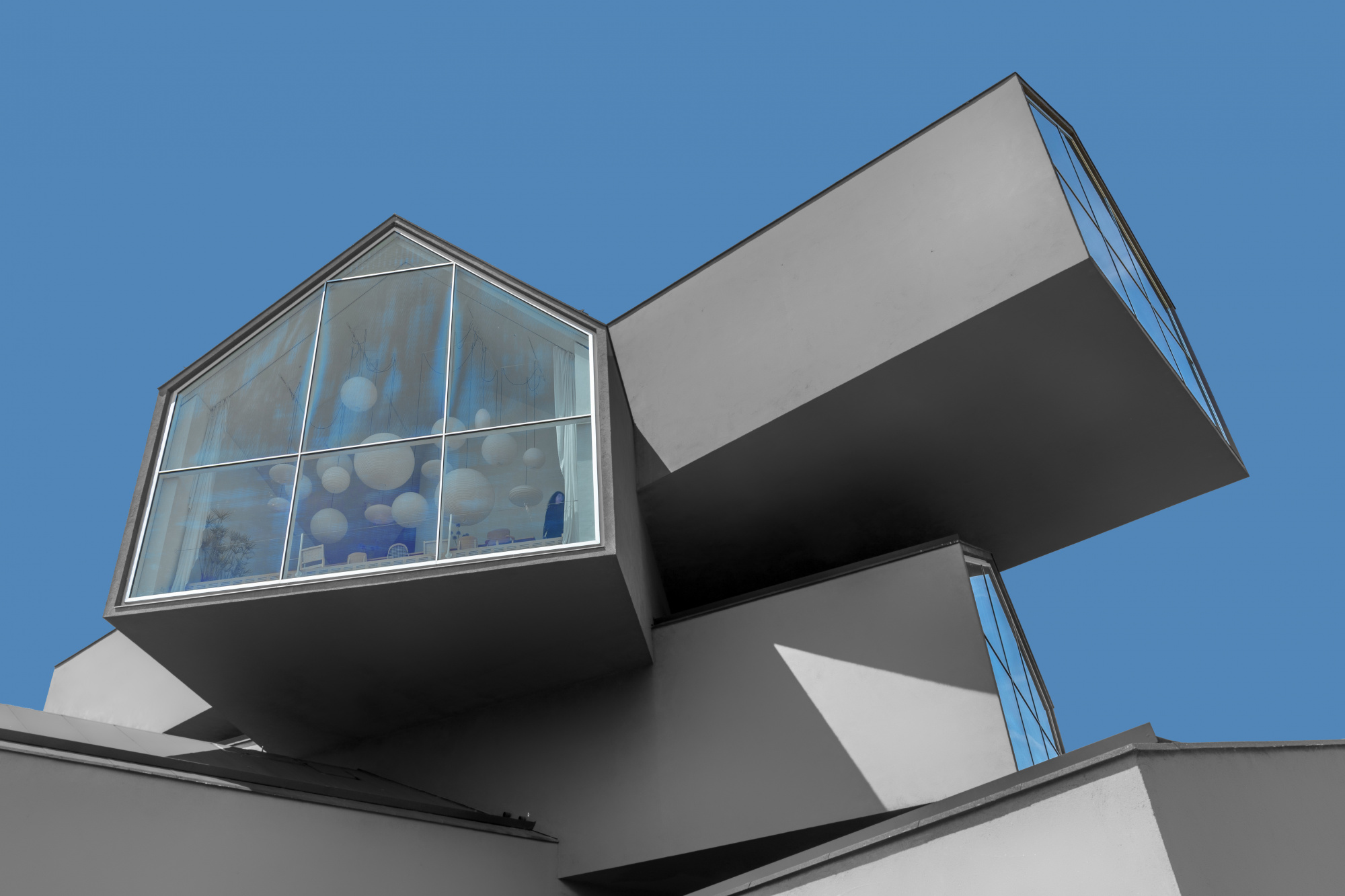
I photographed this well-known building by Herzog & de Meuron because this architecture fascinates me. The editing was done with Photoshop. I used a plugin (forge) to make the sky a little calmer and to enhance the effect of the architecture. I used a tripod for a better quality.
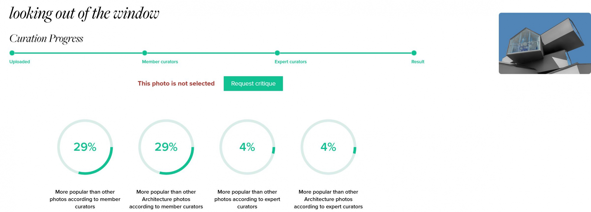
I would be interested to know what I would have to do better to get the photo published. 50% of the criticism is about the technical quality.
processing tool: Photoshop / filter forge
camera: Canon EOS 5D Mark IV
lens: EF24-70 mm f/2.8 L II USM
focal length: 30 mm
aperture: f/16
shutter speed: 4.64s
ISO: 100
tripod used
Urs,
Thanks for submitting this image of this interesting building.
First, I wouldn't pay much attention to the curation feedback on "Technical Quality" as it is meaningless. It is feedback with no context or definition. I'd ignore it.
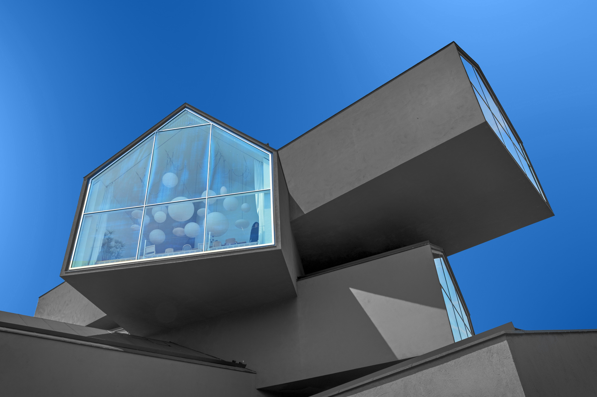
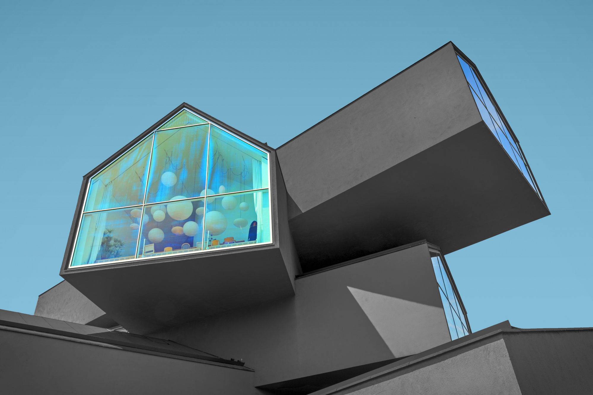
As to the image I find the color of the sky somewhat unnatural and offputting. I took a screen shot into Photoshop. There I replaced the sky color using a technique outlined in this video https://www.youtube.com/watch?v=4jG77DO8Jcw The color I used was the blue in the upper left corner of the top window on the right.
I also used that same color as an overlay on the window on the left setting the opacity to about 40%. The result is a more natural color and uniform color palette throughout.
Hope this gives you some to consider.
Best wishes,
Mike S. - Senior Critic
Dear Mike
Thank you very much for your comment and the suggestion for improvment. I will try it myself.
Best regards
Urs
Urs,
Mike S has given a couple of good suggestions. I agree with him that the sky colour looks a bit strange. As well as the colour, the darkening in the center is unusual. That effect can often come from the combination of wide-angle lens and polarizing filter as the polarization is strongest at 90° to the sun and weaker at lesser or greater angles. Some viewers may have seen the dark center as a filter or editing issue.
I agree with Mike another point too - the percentage scores and pie charts are often, shall we say . . . less than useful. There's no way of knowing who voted, how quickly, or how experienced/skilled they may be at making and judging photographs.
I like the human figure at the bottom right of the window. That's a surprise for viewers who look a bit closer.
From a screen shot I tried a sky replacement too - selecting the subject with Photoshop's 'Select>Subject', then fine tuning that selection with the 'Quick Selection' tool, then inverting the selection and using 'Fill' to replace the sky. A gradient was used to darken the sky towards the top and a bit extra on the top corners. The window was given a bit of saturation with 'Image>Adjustments>Saturation' . I also selected the woman's face and gave it a bit of colour to make her more easily spotted. I'm sure you know these Photoshop tools, but there may be other members reading along who don't.
The exposure settings look good except for the aperture. Very small apertures like f/16 have a cost in image quality because of diffraction. It probably wouldn't have made a noticeable difference here, but f/11 or f/8 would have been optimum. At 30mm you get good depth of field at f/8.
Thanks for sharing the photo with us here in the Critique section, and for thoughtfully including the exposure settings. It certainly is an unusual building. Is it just a private residence, or an office building, or?
. . . . Steven, senior critic
PS: now that I see it next to Mike's blue sky, I think his is nicer.
Dear Steven
Thank you for your suggestions. I see that the sky is the biggest problem, especially because of the colours. The aperture being too closed was also a mistake or carelessness.
I only noticed later that there was a person in the picture. By the way, it's not a residential building, but an exhibition of modern furniture.
Best regards
Urs
Dear Urs
Thanks for submitting your photo to the critique forum.
I like your architecture image but as you know curation is not a science so opinions can vary.
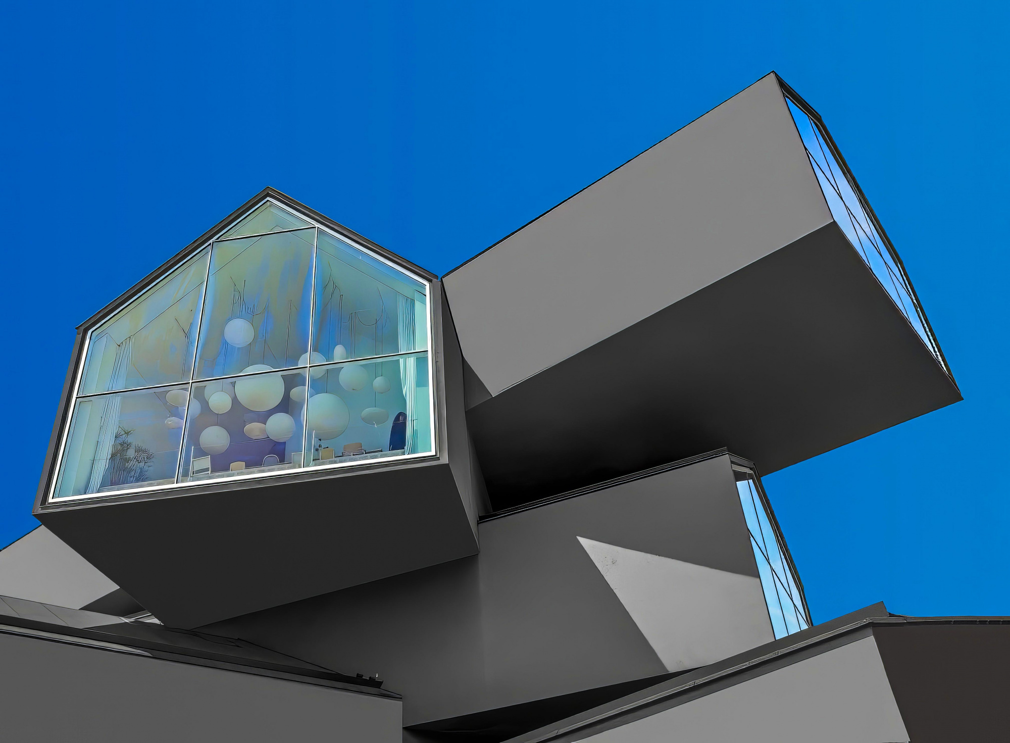
I read my colleagues’ comments and I agree with them, for me the two main issues are the "artificial" sky and the noise from the walls of the building, I also like the cropping to be slightly changed.
I took your photo to Photoshop cropped the image accordingly, I also changed the sky color and variations .and colored the walls in a more unified way (fill – 100% of the color of each wall)
Finally I used Topaz AI for fine tuning.
It is of course just my opinion.
Best regards
Arnon Orbach Senior Critic
Dear Arnon
I have now more or less implemented all the advice, neutralised the sky, reduced the noise of the walls (which is real) and will try again with the result.
Many thanks for the support and best regards
Urs
My various attempts to make the picture better have unfortunately had the opposite effect: The results are worse than the first attempt.
1x is and remains a mystery to me.
My various attempts to make the picture better have unfortunately had the opposite effect: The results are worse than the first attempt.
1x is and remains a mystery to me.
As an infamous US President used to say. "I feel your pain".
I love the updated photo & voted for it to be published. I think that the popularity charts are something of a crapshoot. Cheers!
I love the updated photo & voted for it to be published. I think that the popularity charts are something of a crapshoot. Cheers!
Thank you so much, Thomas!
